Projects
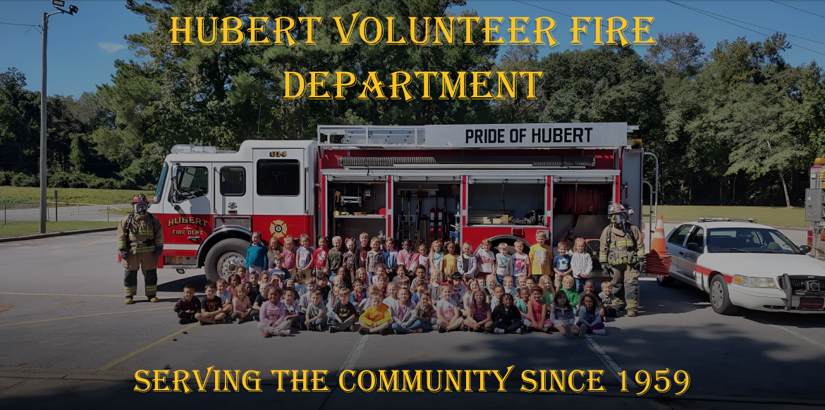
Hubert Volunteer Fire Department (HVFD), is a small volunteer fire department located in Hubert, North Carolina. Their mission is to make their small town a better place in any way possible. One thing HVFD has always struggled with is growing and retaining new members. They believe that it's because of the lack of their online presence. To help them with their mission, my team and I planned to created a website that would allow those who are interested in HVFD to learn about their upcoming events, donate, and volunteer.
We performed a set of user interviews on 2 groups; the first one being individuals who have previously worked with nonprofits in the past. The second group were volunteers at HVFD themselves. These are the insights we gained from our interviews:
We looked into the capabilities of other local fire departments and community centers near HVFD. We learned that, while those organizations pay their employees and had more funding, they also required more certifications and time commitment.
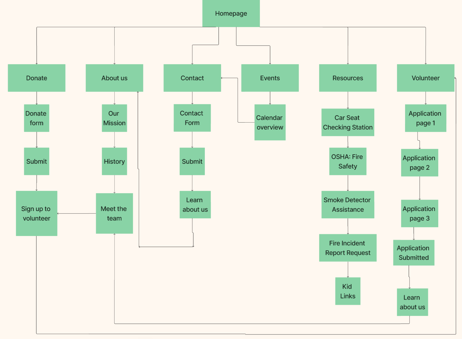
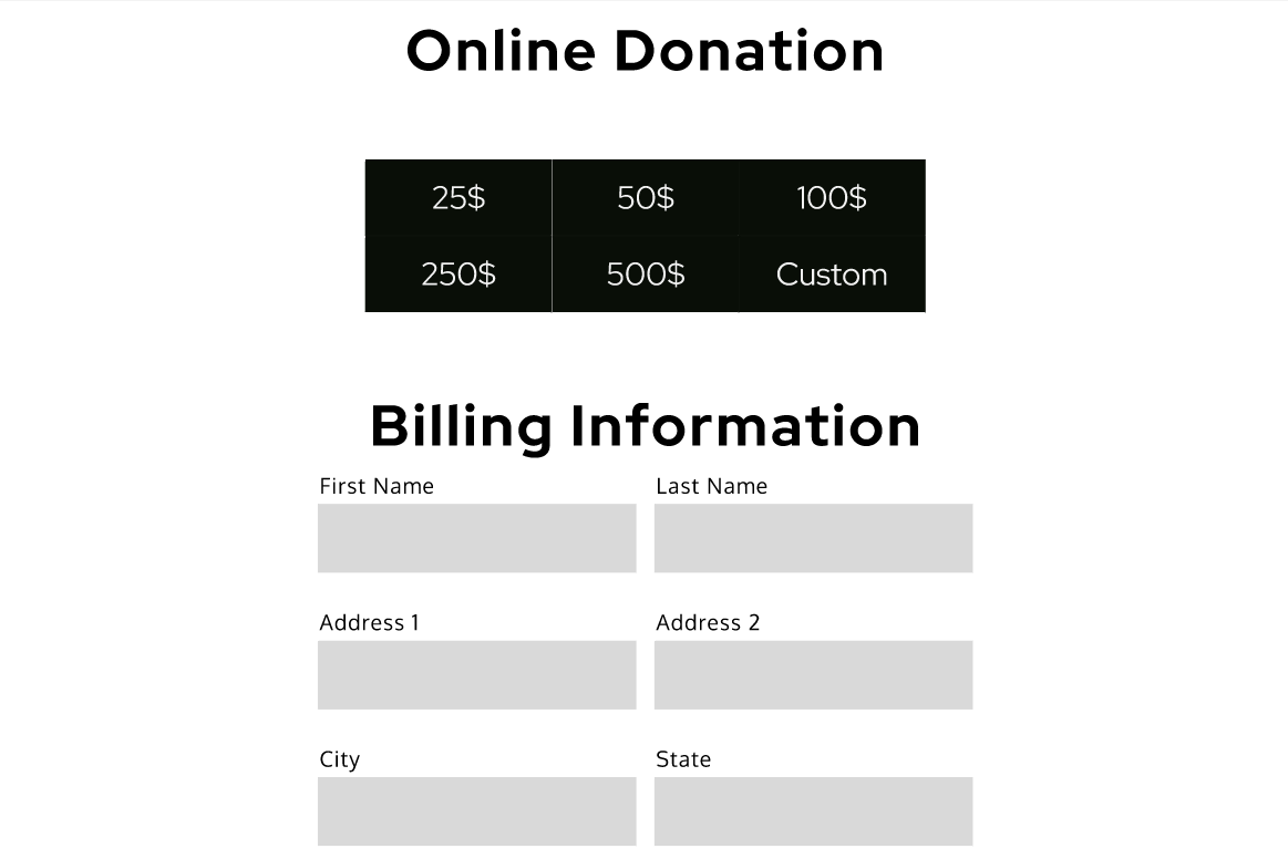
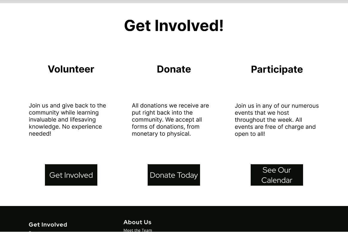
Based on our research, the three main flows we wanted to prioritize were donating, volunteer, and finding event information. We wanted to make sure that all three of those pages were easily accessible from any point of the website.
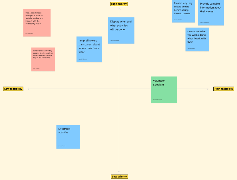
Based on our user research, we compiled a set of ideas of what we wanted to include in HVFD's website. We then used the prioritization matrix to determine which ideas would be the most viable.
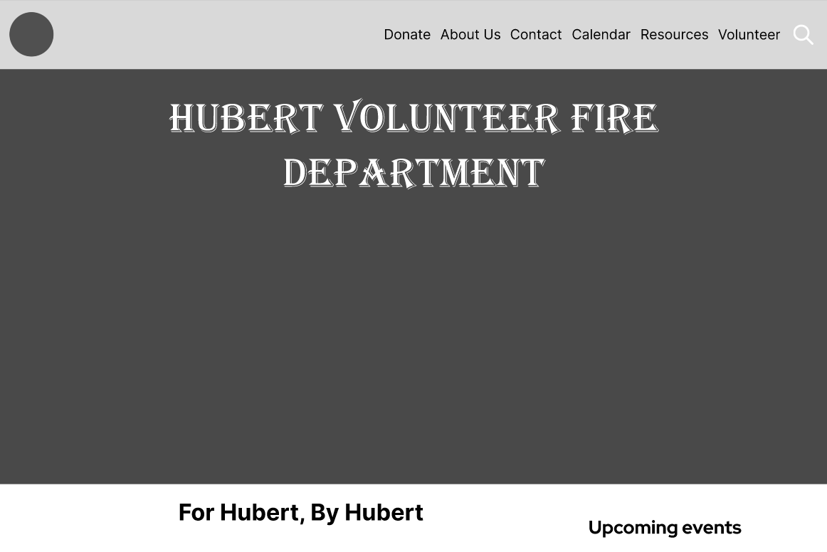
They also gave us full creative liberty of their website design, so we developed a style guide for HVFD. For colors, we decided to match the colors on the badge as it was a good color scheme for a fire department. For fonts, we wanted to give the website a more professional tone. The fonts we chose were Algerian regular, oxygen regular, and red hat display bold.
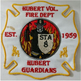
One major issue this project faced was obtaining usable media from HVFD. Not only was the organization slow to respond to any of our queries, but many of the responses, images, and videos the organization provided were nigh unusable due to them being either low quality or not digital. Some of the images we were able to salvage by using AI to upscale them. Their logo, however, was a big challenge. The only image of the logo we received was a picture of a badge. In order to make it usable for the website, I learned how to use GIMP in order to create a digital version of the logo.

.png)
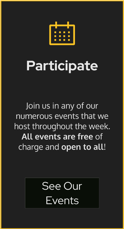
My primary focus on this project was the homepage, the calendar page, and other UI elements. For the navbar, I wanted to make it so that a user could access any page on the website from there. The first iteration featured a dropdown menu when hovering over certain sections, but then I realized that some pages could be condensed into a single page. After redoing the user flow I was able to make every page on the website accessible from the navbar.
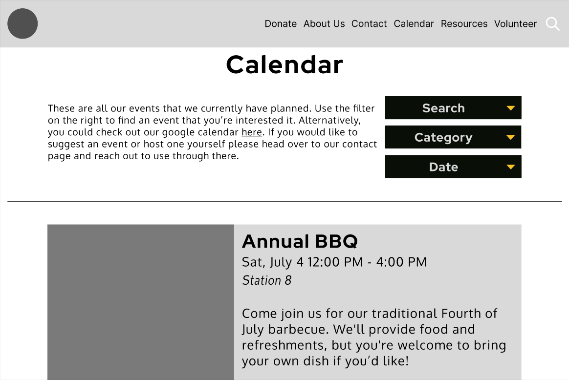
For the calendar, I decided to try a card view rather than a traditional calendar. Not only did I believe that this would be more space-efficient on both desktop and mobile views, but it would also allow users to gather more information about each event in a glance than a calendar did.
Some testers stated that they would have preferred a calendar that marked when events would happen instead. Unfortunately, due to time constraints, we were unable to create a version of the events page with a calendar view.

After each major prototype iteration, we performed a set of user tests. While there were no major issues regarding the usability of the site, there were some comments on the aesthetic. A couple testers expressed how the site was very bright. This was due to our over-usage of the color red. To fix this, we replaced many of the red UI elements of the website with dark grey versions, saving red as a call-to-action color. This made the site less of an eye-strain and more sleek-looking.


.png)

As of now, the project is in a completed state. We presented our current prototype to the client and they were extremely happy with it. The next step would be to recreate the site in Webflow and publish it so that they can use it for their own needs. In addition, I would also like to give them other ways to interact with their users online such as a newsletter and a Google Calendar.